CAMPAIGN
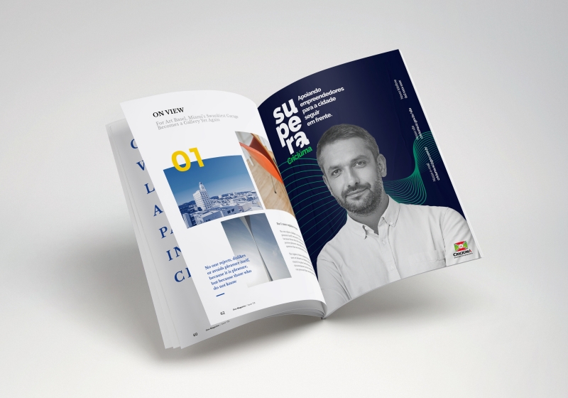
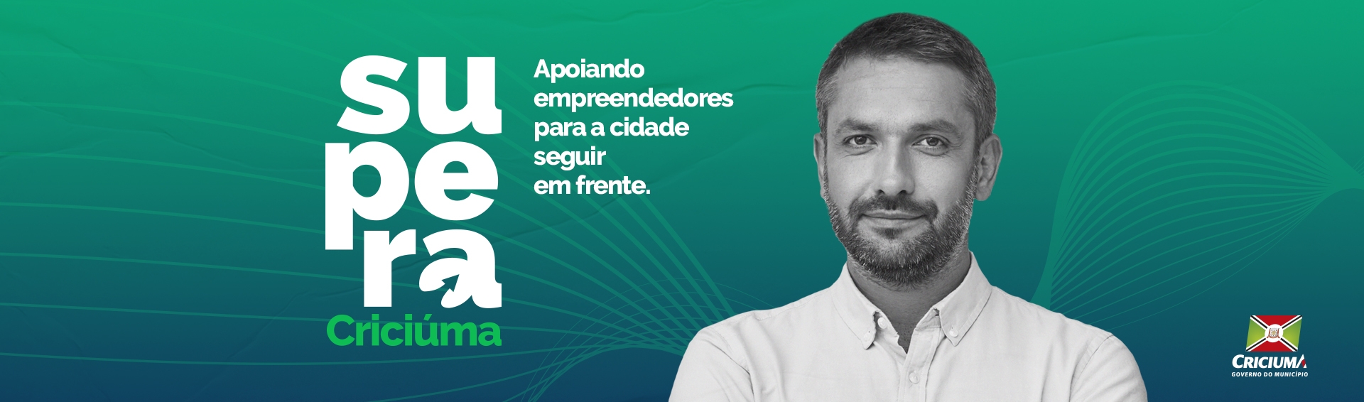
PROJETO SUPERA
CLIENT CITY HALL OF CRICIÚMA/SC
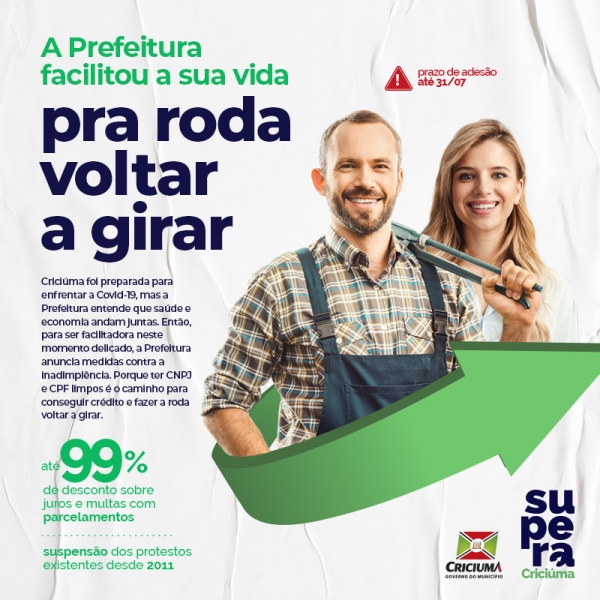
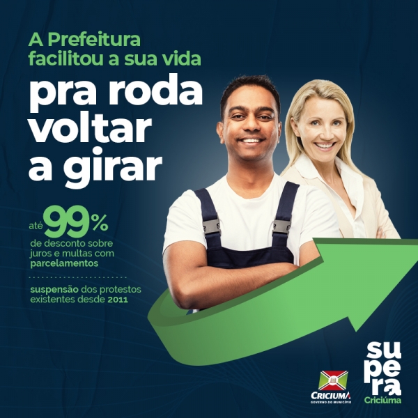
Few words will sum up the moment of confronting the pandemic as well as “overcoming”. To overcome is to turn the game around, to progress without fear and to believe that it is possible.
For this program developed by the Municipality of Criciúma, we tried to create a receptive logo that was aligned with this context. As it is a project that should convey seriousness, confidence and humanization, the choice of colors was based on a palette that transitions between green and navy blue. These colors bring a sense of experience, intelligence and stability.
We work with an elevation symbol, in this case characterized by the arrow that fits in the shape of the letter “A” and gives the feeling of overcoming, of really moving forward.
The brand was used in all the materials of the Supera Program, including in the institutional pieces for publicizing Refis 2020.